Same store.
Built to convert.
The old site was a stock Shopify theme doing the bare minimum: a plain header, a single static banner, and a checkout journey with a dozen small bits of friction stacked on top of each other. We rebuilt it front to back, homepage down to the cart, with one goal: make it easier to go from "just looking" to "checked out."
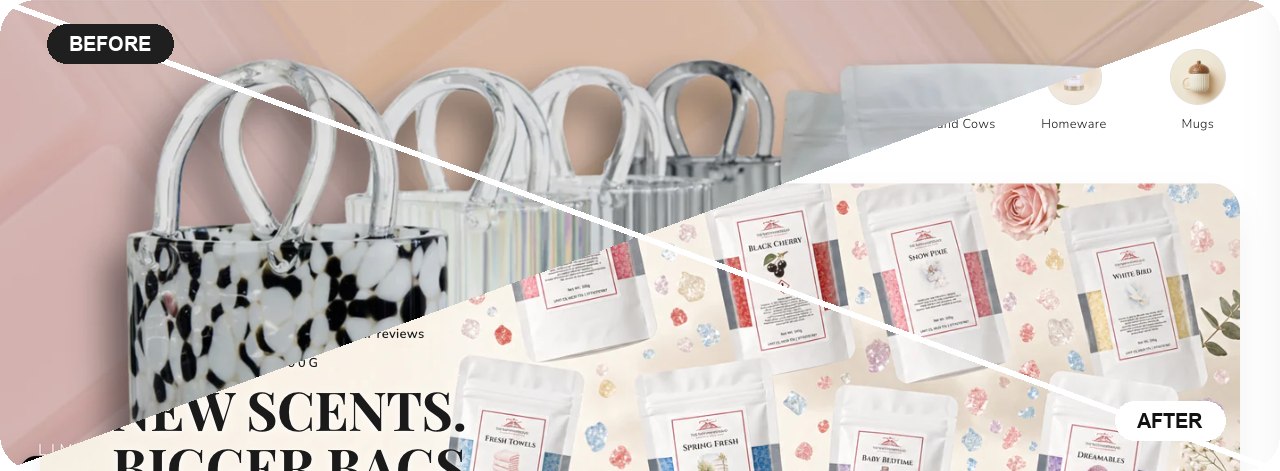
Before and after
Same store, same products. On the left, the old homepage: a single bundle offer up top and a generic layout underneath. On the right, the rebuilt homepage: warm, image-led, and selling the actual product from the moment it loads.
What we actually changed
Not just a fresh coat of paint. Most of the work is the stuff shoppers feel but don't consciously notice, the friction that quietly makes them leave.
The trajectory since launch
The redesign shipped just before the store's first paid social campaign, so the two have been working together rather than in isolation. Here is what the store looks like now, measured against June 2026, the last full month before either went live.
We cannot cleanly separate what share of the revenue growth came from the new site versus the ads themselves, they launched close together. The average order value is the honest one to look at here: it is the number a free shipping progress bar, cross-sells on the product page and a friction-free cart are built to move, and it went from £18.79 to £30.74 on the same catalogue at the same prices. The rest is the two working together. A faster, clearer store with less friction gives every pound of ad spend a better chance of converting once someone lands on it.
Since then the store has kept the pace: £51,153 across 1,762 orders in the first fourteen days of September, and the paid social behind it has returned £164,815 on £29,266 of spend since launch, a blended 5.6× across the whole period.
Slow, cluttered, or just not converting?
We build and rebuild ecommerce and small business sites the same way we grow social accounts, stripped of friction, built around what actually moves people to buy.
Start a project →